Apply Time Series profiles
A profile is a representation of the measurement data plotted over time. Use profiles to explore how your sample changes over time and to explore how the changes correlate to external factors, such as temperature in a TGA-IR experiment.
Profile types
| Profile Type | Description |
|---|---|
| Reconstruct |
This is the default display when you create a Time Series analysis from previous measurements. The Reconstruct simply plots the count of spectra over time. |
| Correlation |
The Correlation profile compares every spectrum to a reference spectrum and shows the match value, like a QCheck analysis. The Y-Axis of the profile curve displays the correlation value, with a 1 indicating a perfect match. Select Set Correlation Reference to set the reference to the currently displayed spectrum. |
| Area |
The Y-Axis of the Area profile shows how a peak area grows or shrinks. |
| Peak |
The peak profile shows the change in peak height. |
|
Area Ratio |
The Area Ratio profile shows the change in a ratio of one peak to another. With this profile, you specify the area for two peaks. The resulting ratio uses the first peak area as the numerator and the second peak area as the denominator. The “Intensity threshold” in this profile refers to the minimum peak area used in the calculation. If either peak area is less than or equal to this minimum value, the result will be 0 instead of the calculated ratio. This is useful for preventing extremely large values as the area of either peak approaches 0. |
| Peak Ratio |
The Peak Ratio profile calculates the ratio of two peak heights. In the Peak Ratio profile, the “Intensity Threshold” refers to the minimum peak height. If either peak is less than or equal to this minimum, the profile plots 0 instead of calculating the ratio. This is useful for preventing extremely large or small values as the height of either peak approaches 0. |
| Chemigram |
The Chemigram profile shows the uncorrected area of the specified region. |
| Peak position |
The peak position profile displays how a specified peak shifts in the series, with the y-axis showing the peak position in wavenumbers. The “Intensity threshold” in this profile refers to a peak height minimum. If the peak is less than or equal to this height, the returned value is NaN, meaning “not a number,” creating a small gap in the curve. The profile curve skips these points and connects the points on either side. If the gap is large, there will be a visible blank space in the profile curve. |
|
Peak Width |
The Peak Width profile measures the changing width in a specific peak. The y-axis value for this profile shows the width of the peak in wavenumbers. The Height% value determines where the peak is measured. For example, if the Height% is set to 75%, the width is measured at 75% of the peak height, as measured from the baseline. The Intensity Threshold in this profile is a peak height minimum. If the peak is less than or equal to the threshold, the width is not calculated and the profile instead returns NaN, meaning “not a number”, and the profile curve skips those values, connecting the points on both sides. If the gap is large, you will see a visible blank area in the profile curve. |
| Quant |
The Quant profile uses a TQ Analyst Quant method to calculate the profile curve. The y-axis value depends on the QNT file you are using. To use a Quant profile, first, go to Identify > Quant Setup and select a QNT file. Then, create a Quant Profile. |
Create and use profiles
There are two categories of profiles
-
Time Series profiles: These profiles are unique to this Time Series analysis. They cannot be reused with other analyses unless you recreate them independently.
-
Favorites: These profiles are shared with all Time Series analyses and can be reused each time you create a Time Series analysis.
To create and apply a profile
-
Select either Time Series or Favorites tab.
-
Click New.
-
Enter a name for the profile. You can always change the name later.
It’s a good idea to use a descriptive name, especially for Quant profiles, to help you understand the profile curve later.
-
Select a profile type. See "Profile types" for a description of each profile.
-
Use the controls to edit the settings.
-
Click Preview to see how the profile curve looks.
-
When you’re done, click Save.
The profile is added to the list in either the Time Series or Favorites tabs, and the profile curve is added to the profile view.
Select Delete to remove and delete a profile.
Select Edit to change the profile name, type, or settings.
View profile data
When you create a profile, it is added to the profiles pane.
-
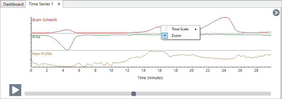
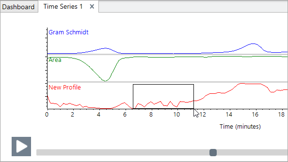
To zoom in on and area of the profile, right-click the profile pane and select Zoom Draw a box and click in the box to zoom.
-
To return to the full profile, double-click the profile pane.
Attachment(s):
| File | Last Modified |
|---|---|
| profile zoom.png | October 11, 2023 |
| zoombox.png | October 11, 2023 |